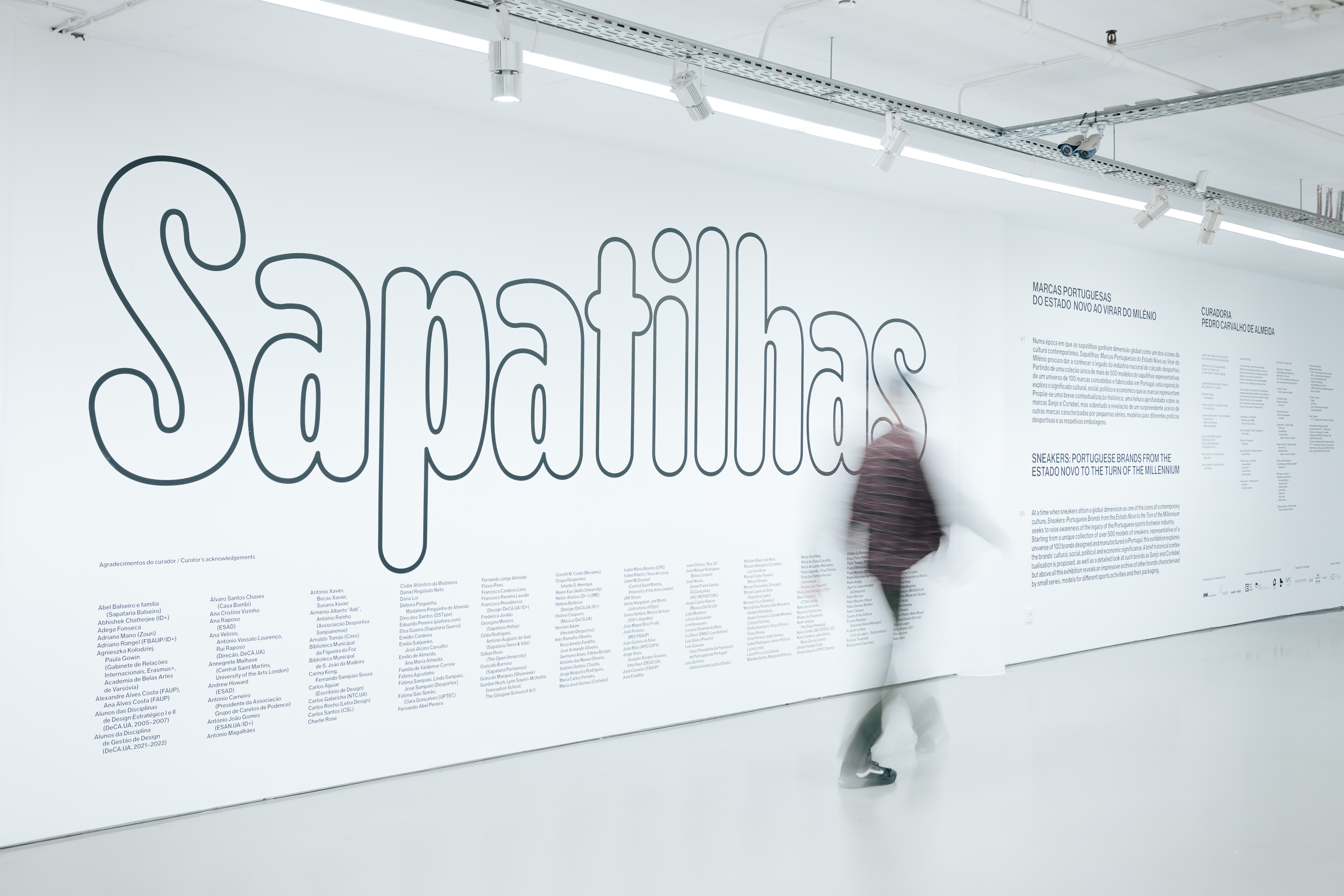
At a time when sneakers attain a global dimension as one of the icons of contemporary culture, Sneakers: Portuguese Brands from the Estado Novo to the Turn of the Millennium seeks to raise awareness of the legacy of the Portuguese sports footwear industry.
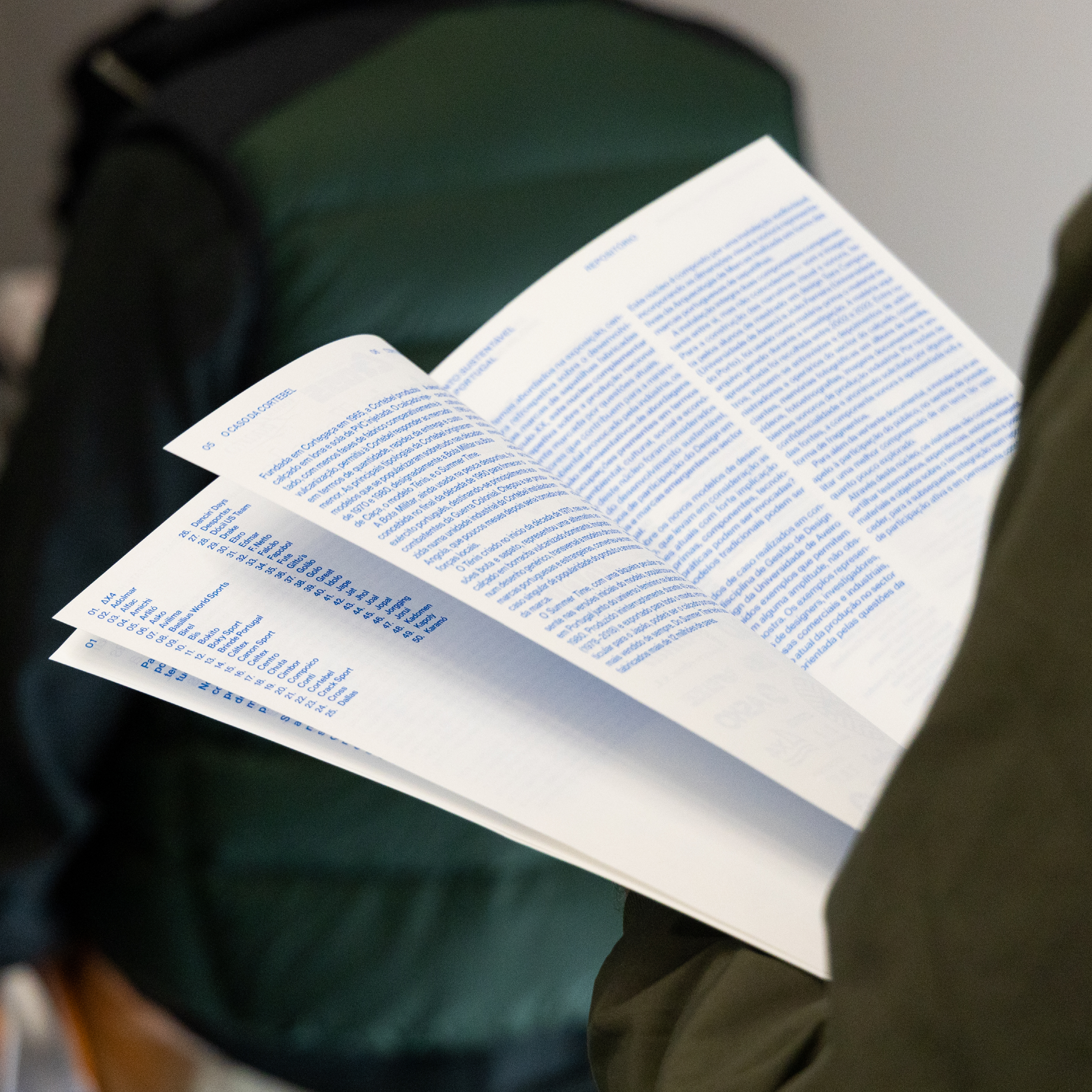
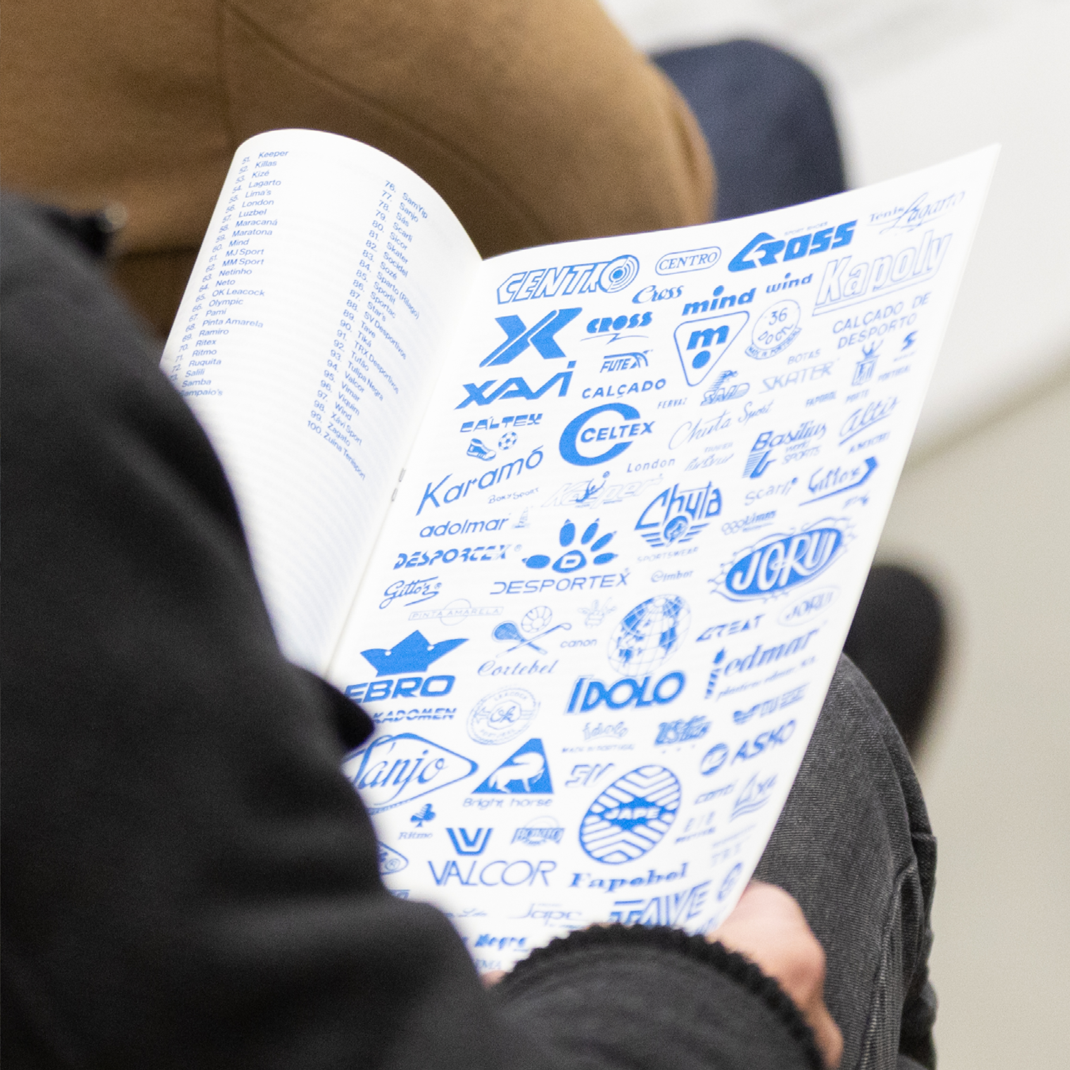
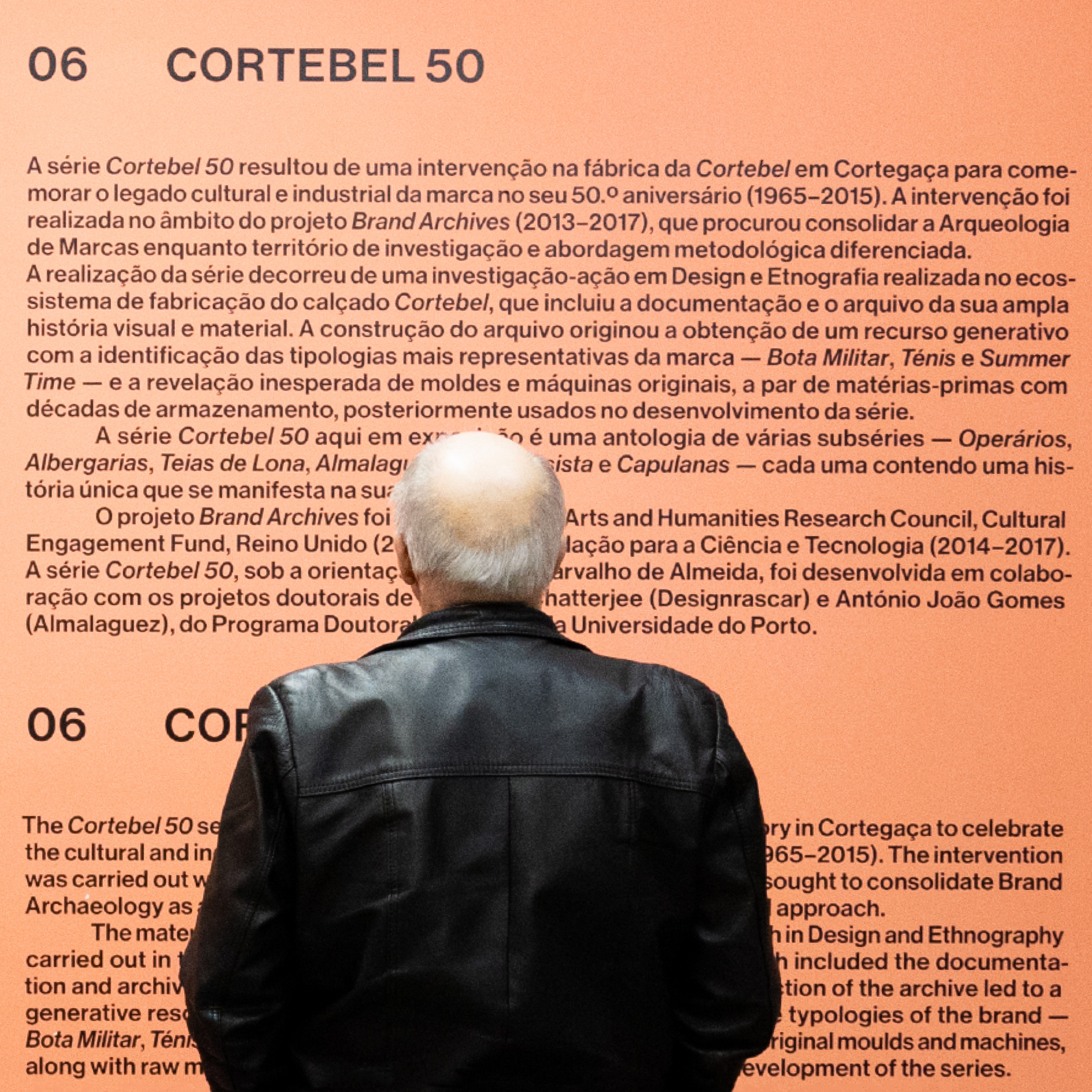
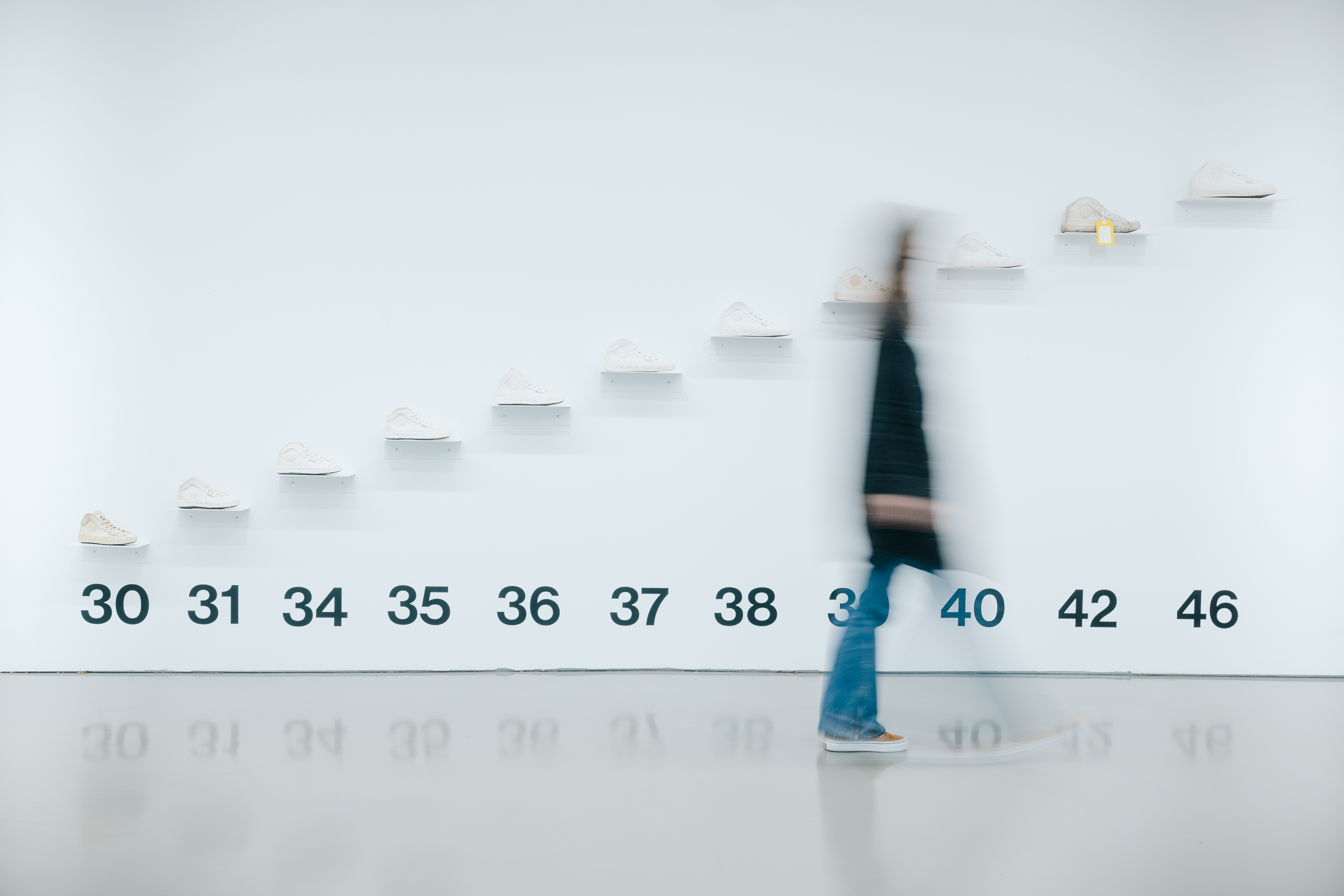
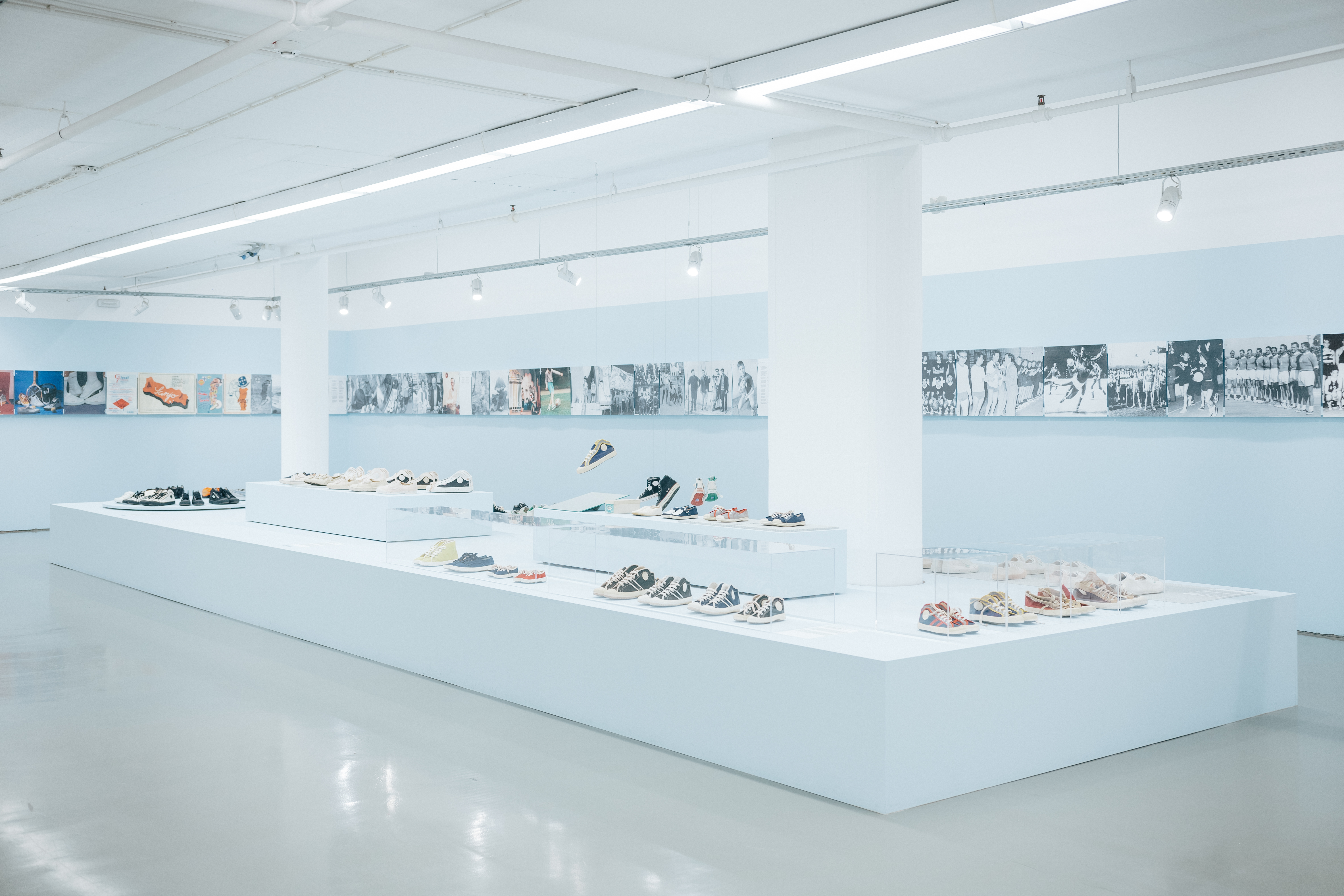
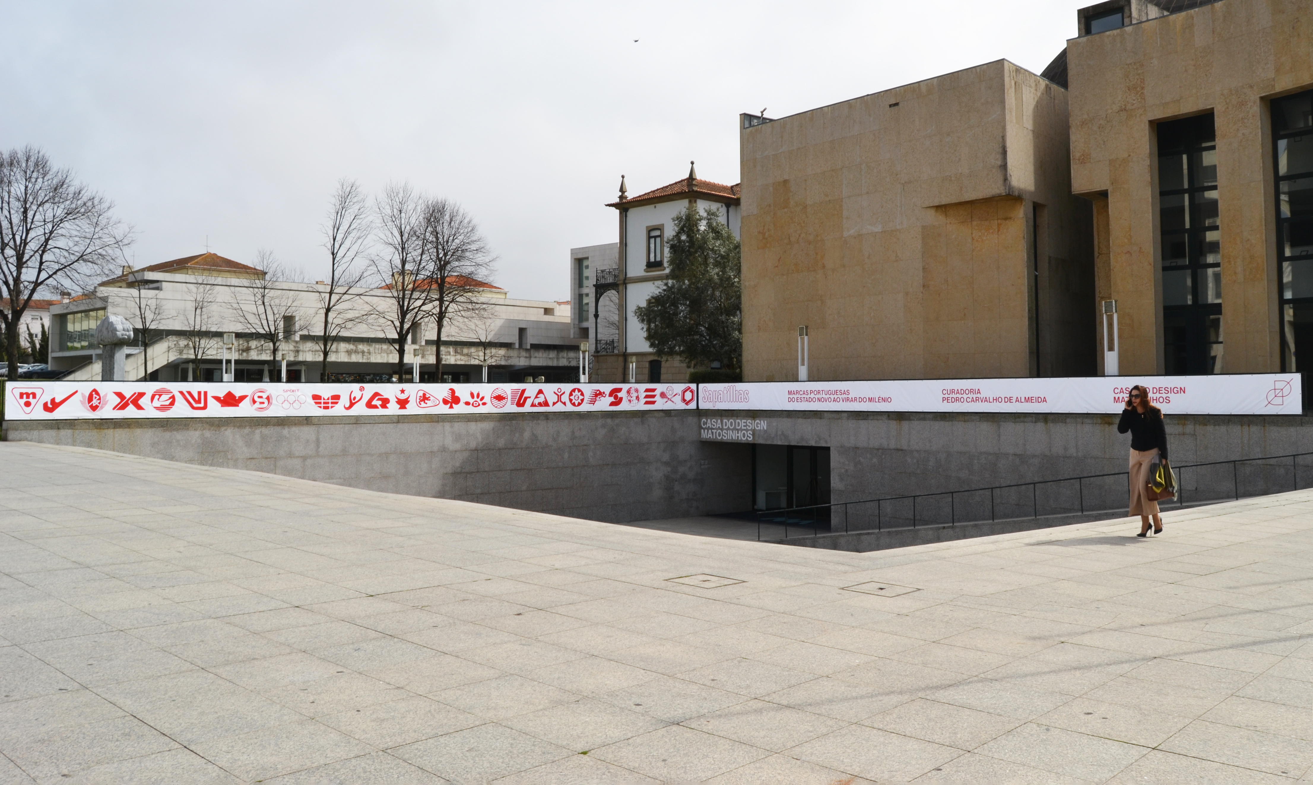
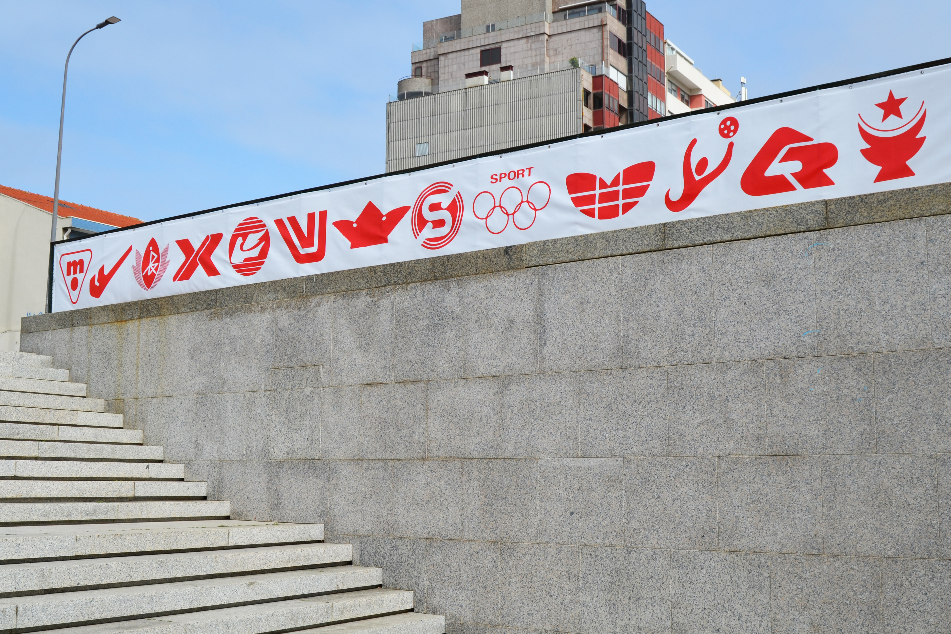
Starting from a unique collection of over 500 models of sneakers, representative of a universe of 100 brands designed and manufactured in Portugal, this exhibition explores the brands’ cultural, social, political, and economic significance. A brief historical contextualization is proposed, as well as a detailed look at such brands as Sanjo and Cortebel, but above all this exhibition reveals an impressive archive of other brands characterized by small series, models for different sports activities, and their packaging.
Given the importance of creating a visual identity that could represent such a broad spectrum of industry developments, we worked closely with the exhibition's head curator, Pedro Carvalho de Almeida, to design an identity that would be both visually engaging and historically relevant.
We began by exploring the specific time frame that the curator wanted to focus on - the 1980s. This period was significant as it marked a time of rapid political, economic, and cultural change in Portugal, with the fall of the dictatorship.
This change was felt acutely in the Portuguese sneaker industry, as the market was suddenly forced to compete with international brands which had a much larger share of the market. This transition presented significant difficulties for Portuguese sneaker brands, as they struggled to find their place in a changing landscape. Many brands were forced to appropriate other identities or rebrand entirely in order to remain competitive, leading to a chaotic and transformative period in the industry's history. The visual identity of the exhibition seeks to capture this moment of change and reflect the evolution of Portuguese sneaker brands as they adapted to the demands of the international market.
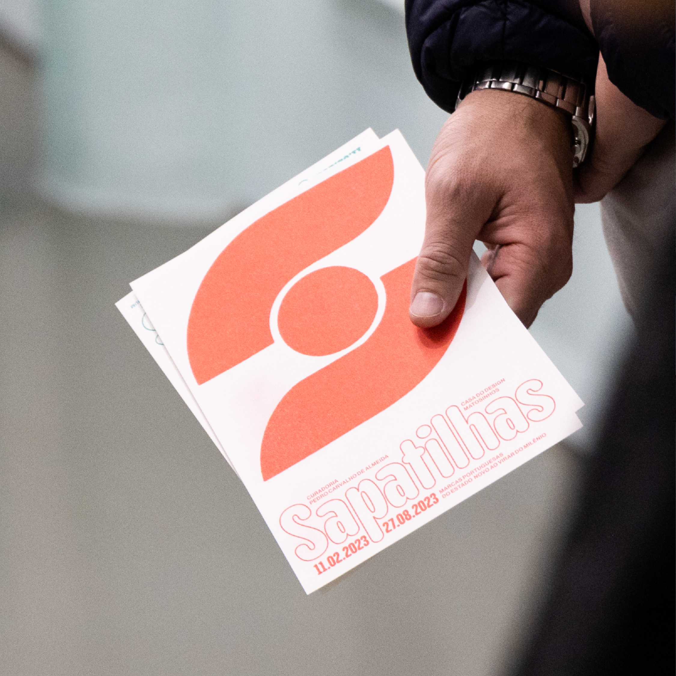
We implemented the visual identity across various materials, such as posters, brochures, and social media graphics. We faced challenges in ensuring the identity remained consistent across all platforms, but we overcame these obstacles by creating clear design guidelines for all materials.
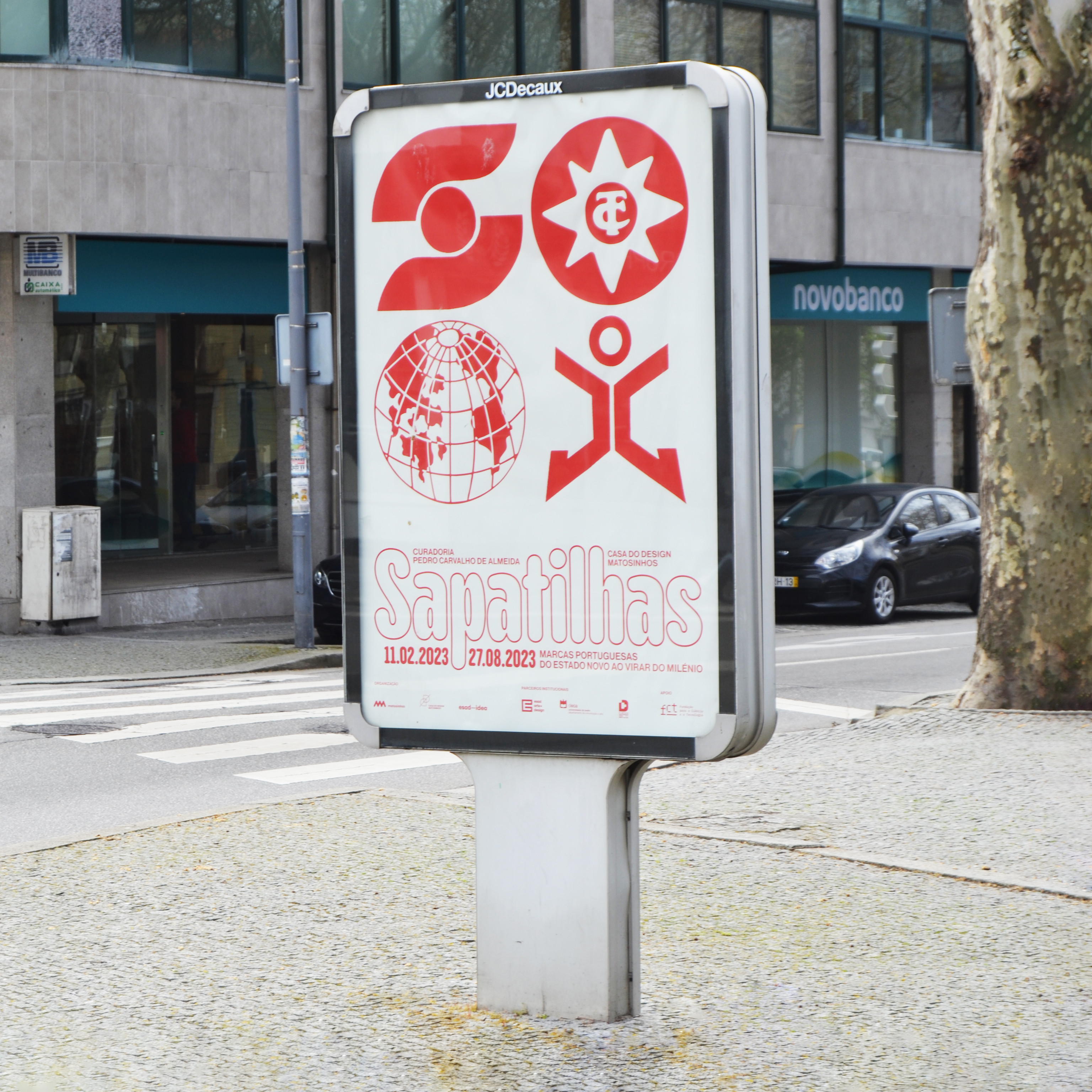
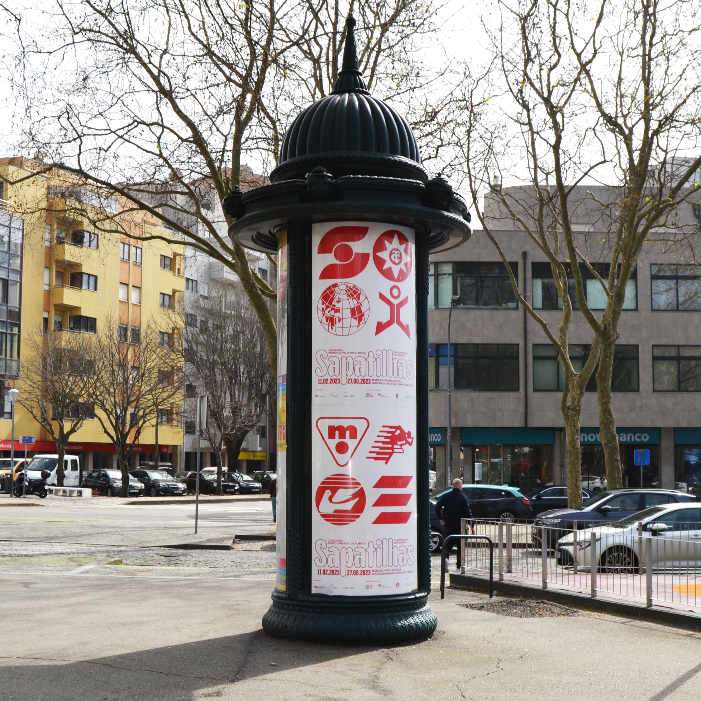
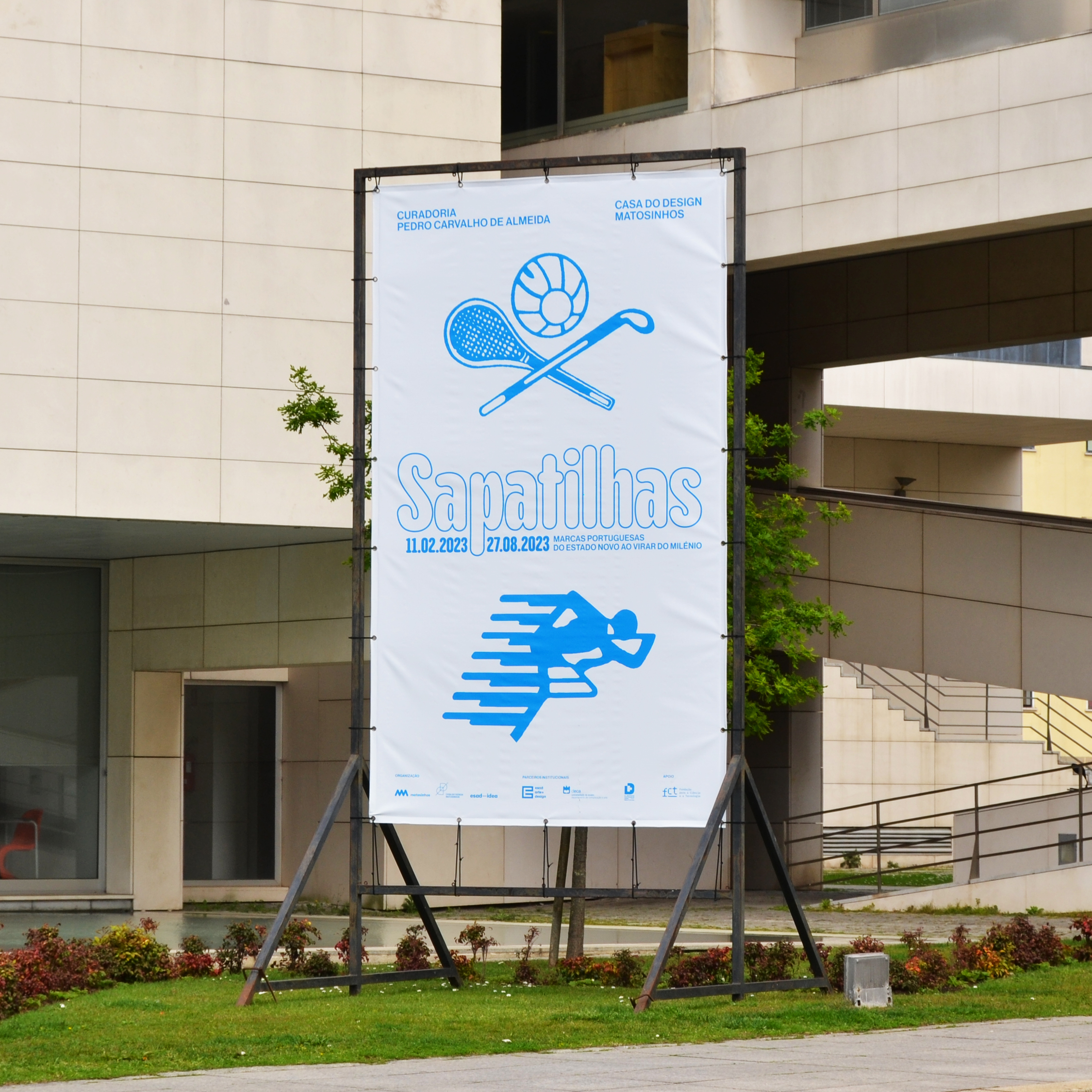
Drawing inspiration from the unique collection of over 500 models of sneakers that served as the backbone of the exhibition, we embarked on a comprehensive exploration of the archive, analyzing everything from advertising campaigns to packaging designs, old documents, and the sneakers themselves. We conducted an extensive research into the colours used in the collection, identifying red, blue, and green as the most dominant. We selected a playful and contemporary typeface, to evoke the approachable and familiar side of the 1980s sneaker culture. Finally, we extracted isotypes from the archive of the Portuguese brands and incorporated them into the visual identity system. These symbols, when combined with the typography and colours, formed a cohesive and recognisable language for the exhibition, highlighting the rich history and diverse range of brands showcased in the collection.
- Design
Pedro Lobo, Susana Martins
- Organised by
Matosinhos City Council
esad—idea, Research in Design and Art
- Curator
Pedro Carvalho de Almeida
- General coordination
Diogo Vilar
- Production management
Sofia Meira
- Exhibition design
Eleonora Fedi
Margarida Santos (internship)
- Copy editing,
proofreading, translation
Andreia Faria
- Photography
Bruno Mesquita, Fernando Miranda